Android ToggleButton
We will learn about the Toggle Button widget of Android in this tutorial. We'll also learn about the various toggle widget attributes that are used to configure this widget.
Android Toggle Button widget can be defined as below –
"Android Toggle button is a widget that are used to display checked/unchecked state as button with light indicator and The ON or OFF text is accompanied by default. And It is subclass of Compound button."
Different Attributes of Android ToggleButton
Attributes in ToggleButton are –
| S. No. | XML Attributes | Description |
| 1 | android:disabledAlpha | This is value of alpha you want to set when indicator is disabled. |
| 2 | android:textOff | Text to be shown when toggle button is in OFF state. |
| 3 | android:textOn | Text to be shown when toggle button is in ON state. |
Attributes in ToggleButton are also inherited from TextView and Compound Button. Some of the popular attributes inherited from TextView are –
| S. No. | XML Attributes | Description |
| 1 | android:id | This is unique id of the ToggleButton to uniquely identify the ToggleButton. |
| 2 | android:height | Sets height of the ToggleButton. |
| 3 | android:width | Sets width of the ToggleButton. |
| 4 | android:text | Sets the text of the ToggleButton. |
| 5 | android:textAllCaps | Shows text in capital letters |
| 6 | android:textColor | Sets color of the text. |
| 7 | android:textSize | Sets size of the text. |
| 8 | android:textStyle | Sets style of the text. For example, bold, italic etc. |
| 9 | android:typeface | Sets typeface of the text. For example, normal, sans, monospace etc. |
| 10 | android:clickable | Sets true when you want to make this View clickable. Otherwise, set false. |
| 11 | android:background | Sets background to this View. |
| 12 | android:backgroundTint | Sets tint to the background. |
| 13 | android:drawableBottom | This is drawable to be drawn at bottom of the text. |
| 14 | android:drawableEnd | This is drawable to be drawn to end of the text. |
| 15 | android:drawableLeft | This is drawable to be drawn to left of the text. |
| 16 | android:drawablePadding | This is padding of the drawable. |
| 17 | android:drawableRight | This is drawable to be drawn to right of the text. |
| 18 | android:drawableStart | This is drawable to be drawn to start of the text. |
| 19 | android:drawableTop | This is drawable to be drawn at top of the text. |
Attributes in ToggleButton inherited from Compound Button are –
| S. No. | XML Attributes | Description |
| 1 | android:button | Drawable used for the button graphic (for example, checkbox and radio button). |
| 2 | android:buttonTint | Tint to apply to the button graphic. |
Note: – Visit android official documentation for more details about attributes of ToggleButton in android.
To create a new android project follow the steps below. If you have already developed the project. Please ignore the steps.
| S. No. | Steps |
| 1 | Open Android Studio. |
| 2 | Go to File => New => New Project. Write application name as ToggleButton. Then, click next button. |
| 3 | Select minimum SDK you need. However, we have selected 14 as minimum SDK. Then, click next button |
| 4 | Then, select Empty Activity => click next => click finish. |
| 5 | If you have followed above process correctly, you will get a newly created project successfully. However, you can also visit tutorial to Create a New Project to know steps in detail. |
Modify Values folder
Open res/values/strings.xml file. Then, add below code into it.
<resources>
<string name="app_name">ToggleButton</string>
<string name="togglebutton">ToggleButton</string>
</resources>
ToggleButton in xml file
Open res/layout/activity_main.xml file. Then, add below code into it
<?xml version="1.0" encoding="utf-8"?>
<android.support.constraint.ConstraintLayout
xmlns:android="http://schemas.android.com/apk/res/android"
xmlns:app="http://schemas.android.com/apk/res-auto"
xmlns:tools="http://schemas.android.com/tools"
android:layout_width="match_parent"
android:layout_height="match_parent"
tools:context=".MainActivity"> <ToggleButton
android:id="@+id/toggleButton"
android:layout_width="wrap_content"
android:layout_height="wrap_content"
android:text="@string/togglebutton"
app:layout_constraintBottom_toBottomOf="parent"
app:layout_constraintLeft_toLeftOf="parent"
app:layout_constraintRight_toRightOf="parent"
app:layout_constraintTop_toTopOf="parent"/>
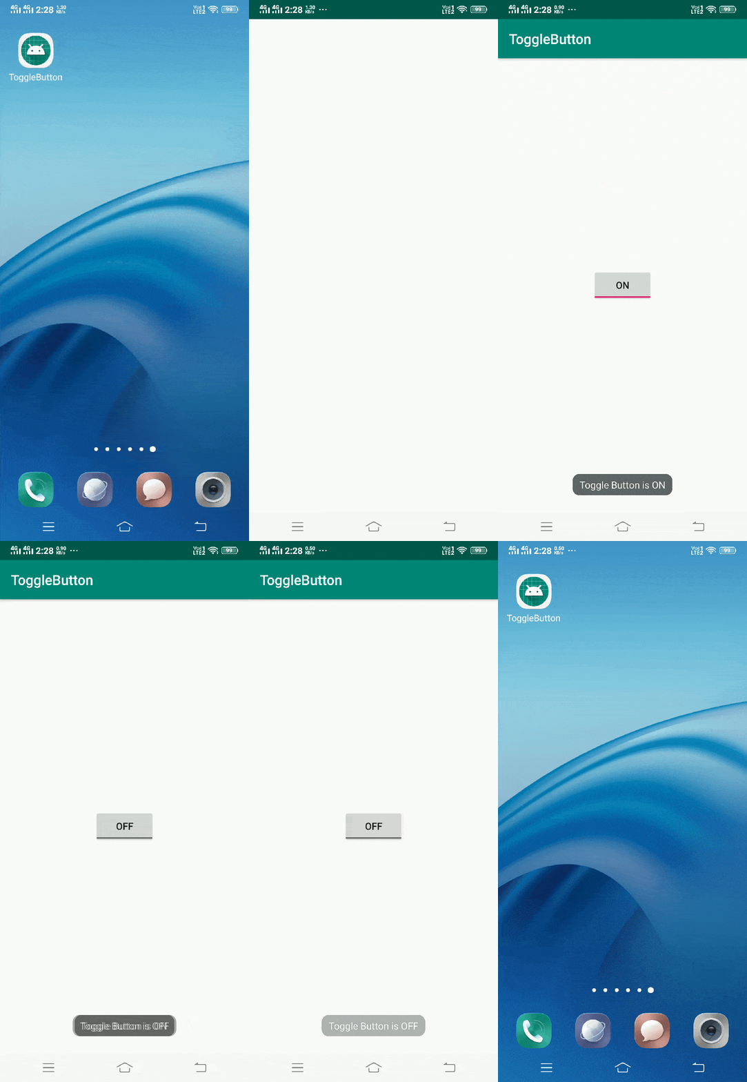
</android.support.constraint.ConstraintLayout>Here, we have defined ToggleButton in xml file. Now, we will access this ToggleButton in java file and show a toast message when it is checked on/off.
Toggle Button in java file
Open src/main/java/com.ukacademe.togglebutton/MainActivity.java file. Then, add below code into it.
package com.ukacademe.togglebutton;

import android.support.v7.app.AppCompatActivity;
import android.os.Bundle;
import android.widget.CompoundButton;
import android.widget.Toast;
import android.widget.ToggleButton;


public class MainActivity extends AppCompatActivity {

    @Override
    protected void onCreate(Bundle savedInstanceState) {
        super.onCreate(savedInstanceState);
        setContentView(R.layout.activity_main);
        ToggleButton toggleButton = findViewById(R.id.toggleButton);
        if (toggleButton != null) {
            toggleButton.setOnCheckedChangeListener(new CompoundButton.OnCheckedChangeListener() {
                @Override
                public void onCheckedChanged(CompoundButton buttonView, boolean isChecked) {
                    String msg = "Toggle Button is " + (isChecked ? "ON" : "OFF");
                    Toast.makeText(MainActivity.this, msg, Toast.LENGTH_SHORT).show();
                }
            });

        }
    }
}
Since AndroidManifest.xml is very importatnt file for any android application . We are also going to mention it here.
Android Manifest.xml file
Code inside main/AndroidManifest.xml file is as below.
<?xml version="1.0" encoding="utf-8"?>
<manifest package="com.ukacademe.togglebutton"
xmlns:android="http://schemas.android.com/apk/res/android">
<application android:allowBackup="true"
android:icon="@mipmap/ic_launcher"
android:label="@string/app_name"
android:roundIcon="@mipmap/ic_launcher_round"
android:supportsRtl="true"
android:theme="@style/AppTheme">
<activity android:name=".MainActivity">
<intent-filter>
<action android:name="android.intent.action.MAIN"/>

<category android:name="android.intent.category.LAUNCHER"/>
</intent-filter>
</activity>
</application>
</manifest>
Now, when we run the application, we will get output as shown below.
Output

