Android CheckBox
In this tutorial, we will learn with the example how to use android checkbox. We will learn about different attributes that are used to customise this widget.
Android Checkbox can be described as below –
"CheckBox is a type of two state button either checked or unchecked. There can be a lot of use of checkboxes."
Different Attributes of Android CheckBox
CheckBox widget attributes are inherited from the TextView, View and Compound Button. Some of the popular attributes inherited from TextView are –
| S. No. | XML Attributes | Description |
| 1 | android:backgroundTint | Sets tint to the background. |
| 2 | android:clickable | Sets true when you want to make View clickable. Otherwise, set false. |
| 3 | android:drawableBottom | Drawable to be drawn at bottom of the text. |
| 4 | android:drawableEnd | Drawable to be drawn to end of the text. |
| 5 | android:drawableLeft | Drawable to be drawn to left of the text. |
| 6 | android:drawablePadding | Padding of the drawable. |
Attributes of CheckBox inherited from Compound Button are –
| S. No. | XML Attributes | Description |
| 1 | android:button | Drawable to be used for button graphic. |
| 2 | android:buttonTint | Sets tint to button graphic. |
| 3 | android:buttonTintMode | Blending mode used to apply the button graphic tint. |
Attributes of CheckBox inherited from View are –
| S. No. | XML Attributes | Description |
| 1 | android:id | This is unique id of the Checkbox to uniquely identify the Checkbox. |
| 2 | android:padding | Sets padding of this view. |
| 3 | android:onClick | Defines the operations to perform when this view is clicked. |
| 4 | android:visibility | Sets the visibility (visible, gone etc.) of the Checkbox. |
| 5 | android:tooltipText | Defines text displayed in a small popup window on hover or long press. |
| 6 | android:background | Sets background to this view. |
| 7 | android:alpha | Sets alpha in view. |
Follow steps below to create new android project. Please ignore the steps if you've already created android application.
| S. No. | Steps |
| 1 | Open Android Studio. |
| 2 | Go to File => New => New Project. Write application name as Checkbox. Then, click next button. |
| 3 | Select minimum SDK you need. However, we have selected 14 as minimum SDK. Then, click next button. |
| 4 | Then, select Empty Activity => click next => click finish. |
| 5 | If you have followed above process correctly, you will get a newly created project successfully. However, you can also visit Tutorial to Create a New Project to know steps in detail. |
Now, when you click CheckBox we will modify xml and java files to modify the action. Please follow the steps below.
Modify Values folder
Open res/values/strings.xml file. Then, add below code into it.
<resources>
<string name="app_name">CheckBox</string>
<string name="check_it">Check it</string>
</resources>
Other values folder have not been changed. So, we're not going to mention it here.
Checkbox in xml file
Open res/layout/activity_main.xml file. Then, add below code into it.
<?xml version="1.0" encoding="utf-8"?>
<android.support.constraint.ConstraintLayout
xmlns:android="http://schemas.android.com/apk/res/android" xmlns:app="http://schemas.android.com/apk/res-auto"
xmlns:tools="http://schemas.android.com/tools"
android:layout_width="match_parent"
android:layout_height="match_parent" tools:context=".MainActivity">

<CheckBox
android:id="@+id/checkbox"
android:layout_width="wrap_content"
android:layout_height="wrap_content"
android:text="@string/check_this"
app:layout_constraintBottom_toBottomOf="parent"
app:layout_constraintLeft_toLeftOf="parent"
app:layout_constraintRight_toRightOf="parent"
app:layout_constraintTop_toTopOf="parent" />

</android.support.constraint.ConstraintLayout>
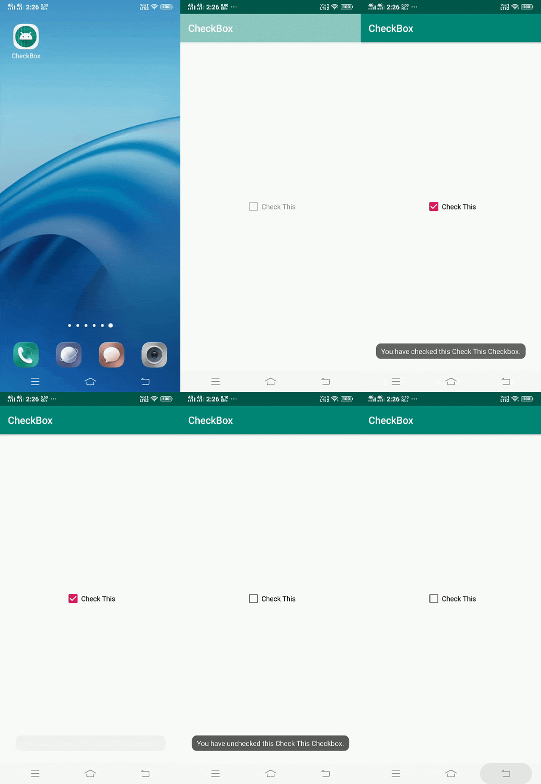
Note that in xml file we have defined CheckBox widget with id CheckBox. Now, in java file we will access this checkbox widget. Then, when the CheckBox is clicked we will show a toast message.
Checkbox in java file
Open src/main/java/com.ukacademe.checkbox/MainActivity.java file. Then, add below code into it.
package com.ukacademe.checkbox;

import android.support.v7.app.AppCompatActivity;
import android.os.Bundle;
import android.widget.CheckBox;
import android.widget.CompoundButton;
import android.widget.Toast;

public class MainActivity extends AppCompatActivity {

    @Override
    protected void onCreate(Bundle savedInstanceState) {
        super.onCreate(savedInstanceState);
        setContentView(R.layout.activity_main);

        CheckBox checkBox = findViewById(R.id.checkbox);
        if (checkBox != null) {
            checkBox.setOnCheckedChangeListener(new CompoundButton.OnCheckedChangeListener() {
                @Override
                public void onCheckedChanged(CompoundButton buttonView, boolean isChecked) {
                    String msg = "You have " + (isChecked ? "checked" : "unchecked") + " this Check This Checkbox.";
                    Toast.makeText(MainActivity.this, msg, Toast.LENGTH_SHORT).show();
                }
            });
        }

    }
}
Note that we have added a listener when the checked/unchecked state is changed in the checkbox. Since the file of AndroidManifest is very important for any android application. We are also going to mention it here.
AndroidManifest.xml file
Code inside main/AndroidManifest.xmlfile is as below.
<?xml version="1.0" encoding="utf-8"?>
<manifest xmlns:android="http://schemas.android.com/apk/res/android"
package="com.ukacademe.checkbox">

<application
android:allowBackup="true"
android:icon="@mipmap/ic_launcher"
android:label="@string/app_name"
android:roundIcon="@mipmap/ic_launcher_round" android:supportsRtl="true"
android:theme="@style/AppTheme">
<activity android:name=".MainActivity">
<intent-filter>
<action android:name="android.intent.action.MAIN" />
<category android:name="android.intent.category.LAUNCHER" /> </intent-filter>
</activity>
</application>

</manifest>
When you run the application, you will get output as shown below.
Output

