Android Switch
Android Switch widget can be defined as below –
"Switch is a two-state toggle switch widget that can select between two options. It is used to display a button with a slider control for a user, which is checked and unchecked. Switch is a subclass of CompoundButton. Basically it is an off/on button that shows the current switch status. It is commonly used in selecting on/off in Sound, Bluetooth, WiFi etc."
Attributes of Android Switch
Some of the popular attributes of android switch are –
| S. No. | XML Attributes | Description |
| 1 | android:id | This is unique id of the switch to uniquely identify the switch. |
| 2 | android:clickable | Sets whether this view is clickable or not. |
| 3 | android:background | Sets background of the view. |
| 4 | android:focusable | It controls whether a view can take focus or not. |
| 5 | android:showText | Sets whether we want to show text(ON/OFF) or not. |
| 6 | android:textOff | Text to be shown when Switch is in OFF state. |
| 7 | android:textOn | Text to be shown when Switch is in ON state. |
| 8 | android:textStyle | Sets style of the text. For example, bold, italic etc. |
| 9 | android:thumb | Sets drawable to be used as thumb that are moved back and forth. |
| 10 | android:thumbTextPadding | Sets amount of padding on either side of text within the switch thumb. |
| 11 | android:thumbTint | Tint to apply to the thumb. |
| 12 | android:thumbTintMode | Blending mode used to apply the thumb tint. |
| 13 | android:track | Drawable of the track in which thumb slides back and forth. |
| 14 | android:typeface | Specifies typeface for the text. For example, normal, sans, serif, monospace etc. |
Some of the popular attributes of android switch inherited from Compound Button are –
| S. No. | XML Attributes | Description |
| 1 | android:button | Sets drawable to button graphic. |
| 2 | android:buttonTint | Tint to apply to button tint. |
| 3 | android:buttonTintMode | Blending mode used to apply to button graphic tint. |
Some of the popular attributes of android switch inherited from TextView are –
| S. No. | XML Attributes | Description |
| 1 | android:autoLink | Specifies whether text such as email, url should be automatically detected and converted into links or not. |
| 2 | android:ems | Makes the TextView be exactly this ems wide |
| 3 | android:cursorVisible | Specifies whether cursor should be visible or not. |
| 4 | android:drawableBottom | Sets drawable to be shown below text |
At first, we will create android application. Then, we will use android switch in this application.
Follow the steps below to create new application. Please ignore the steps if you've already created the application.
| S. No. | Steps |
| 1 | Open Android Studio. |
| 2 | Click on Start a new Android Studio Project Write application name as Switch. Then, click next button. |
| 3 | Select minimum SDK you need. However, we have selected 14 as minimum SDK. Then, click next button |
| 4 | Then, select Empty Activity => click next => click finish. |
| 5 | If you have followed above process correctly, you will get a newly created project successfully. However, you can also visit tutorial to Create a New Project to know steps in detail. |
Now, we'll modify xml and java file to use switch in the application.
Modify Values folder
Open res/values/strings.xml file. Then, add below code into it.
<resources>
<string name="app_name">Switch</string>
</resources>
Since other values folders have not been changed. So, we're not going to mention it here.
Switch in xml file
Open res/layout/activity_main.xml file. Then, add below code into it.
<?xml version="1.0" encoding="utf-8"?>
<android.support.constraint.ConstraintLayout xmlns:android="http://schemas.android.com/apk/res/android"
xmlns:app="http://schemas.android.com/apk/res-auto"
xmlns:tools="http://schemas.android.com/tools"
android:layout_width="match_parent"
android:layout_height="match_parent"
tools:context=".MainActivity">

<Switch
android:id="@+id/switchs"
android:layout_width="wrap_content"
android:layout_height="wrap_content"
android:text="OFF"
app:layout_constraintBottom_toBottomOf="parent"
app:layout_constraintLeft_toLeftOf="parent"
app:layout_constraintRight_toRightOf="parent"
app:layout_constraintTop_toTopOf="parent" />

</android.support.constraint.ConstraintLayout>
In activity_main.xml file, we have used Switch in xml file. Now, we will access this switch in java file.
Switch Widget in java file
Open src/main/java/com.ukacademe.aswitch/MainActivity.java file. Then, add below code into it.
package com.ukacademe.aswitch;

import android.support.v7.app.AppCompatActivity;
import android.os.Bundle;
import android.widget.CompoundButton;
import android.widget.Switch;
import android.widget.Toast;

public class MainActivity extends AppCompatActivity {

    @Override
    protected void onCreate(Bundle savedInstanceState) {
        super.onCreate(savedInstanceState);
        setContentView(R.layout.activity_main);

        final Switch switchs = findViewById(R.id.switchs);
        if (switchs != null) {
            switchs.setOnCheckedChangeListener(new CompoundButton.OnCheckedChangeListener() {
                @Override
                public void onCheckedChanged(CompoundButton buttonView, boolean isChecked) {
                    String msg = isChecked ? "ON" : "OFF";
                    Toast.makeText(MainActivity.this, msg, Toast.LENGTH_SHORT).show();
                    switchs.setText(msg);
                }
            });
        }

    }
}
In MainActivity.java, we have accessed switch. We also set a checked listener to display toast message that displays the checked siwtch status. Since the file of AndroidManifest.xml is very important in any android application, we are also going to mention it
AndroidManifest.xml
Code inside src/main/AndroidManifest.xml file is as below –
<?xml version="1.0" encoding="utf-8"?>
<manifest xmlns:android="http://schemas.android.com/apk/res/android"
package="com.ukacademe.aswitch">

<application
android:allowBackup="true"
android:icon="@mipmap/ic_launcher"
android:label="@string/app_name"
android:roundIcon="@mipmap/ic_launcher_round"
android:supportsRtl="true"
android:theme="@style/AppTheme">
<activity android:name=".MainActivity">
<intent-filter>
<action android:name="android.intent.action.MAIN" />

<category android:name="android.intent.category.LAUNCHER" />
</intent-filter>
</activity>
</application>

</manifest>
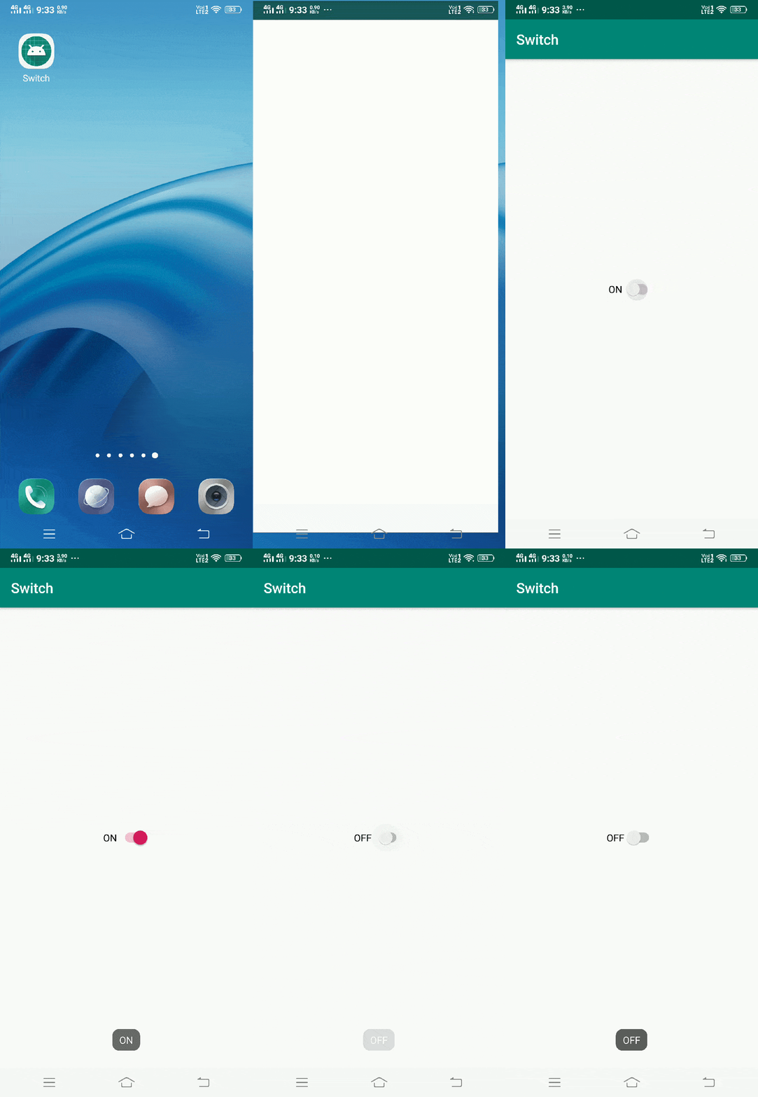
When we run the application, we will get output as shown below.
Output

