What is Responsive Web Design?
Responsive web design involves the use of HTML and CSS to resize, hide, decrease and enlarge a website, to make it appear good on every device (desktops, tablets and phones)
Setting The Viewport
Add the following <meta> component to all web pages when creating reactive web pages:
Example:
<!DOCTYPE html>
<html>
<meta name="viewport" content="width=device-width, initial-scale=1.0">
<body>
<h2>Setting the Viewport</h2>
<p>This example doesn't show anything other than how to add the meta element viewport.</p>
</body>
</html>
Output:
Setting the Viewport
This example doesn't show anything other than how to add the meta element viewport.
This sets our page viewpoint, which gives the browser directions on how the page sizes and scaling can be controlled.
An instance of a web page without a meta tag viewpoint and the same webpage with the meta tag viewpoint is given here:
Responsive Images
Responsive pictures are pictures that fit any size of browser.
How to make Image Responsive?
By using the width property
The picture will respond and scale up and down if the CSS width property is 100%.
Example:
<!DOCTYPE html>
<html>
<meta name="viewport" content="width=device-width, initial-scale=1.0">
<body>
<h2>Responsive Image</h2>
<p>The picture will scale up and back when the browser window size is resized when the CSS width property is set in a percentage value. To view the impact, resize the browser window.</p>
<img src="https://ukacademe.com/Examples/Uttarakhand.jpg" style="width:100%;">
</body>
</html>
Output:
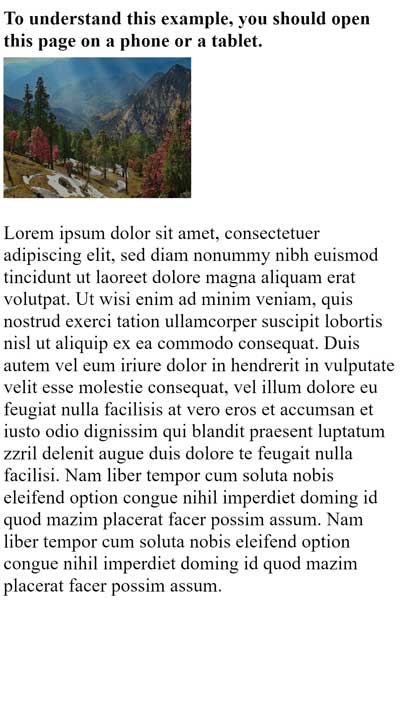
Responsive Image
The picture will scale up and back when the browser window size is resized when the CSS width property is set in a percentage value. To view the impact, resize the browser window.

Note: that the picture may be bigger than its initial size in the instance above. In many instances, the max-width property will instead be a better option.
Using The Max-Width Property
When the maximum width is set to 100%, if the image needs to be scaled, but it never exceeds its original dimensions:
The picture is not growing larger than the initial dimension by max width: 100%. However, the picture will still scale down if you make the browser window bigger.
Example:
<!DOCTYPE html>
<html>
<meta name="viewport" content="width=device-width, initial-scale=1.0">
<body>
<h2>Responsive Image</h2>
<p>The picture is not growing larger than the initial dimension by max width: 100 percent. However, the picture will still scale down if you make the browser window bigger.</p>
<p>Browser window resize to view the impact.</p>
<img src="https://ukacademe.com/Examples/Uttarakhand.jpg" style="max-width:100%;height:auto;">
</body>
</html>
Output:
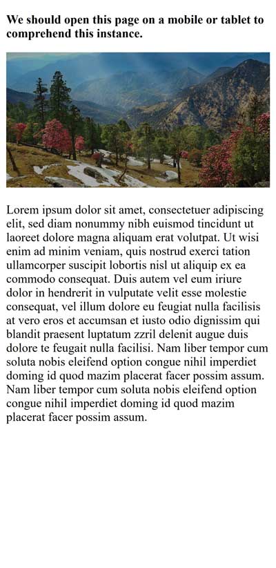
Responsive Image
The picture is not growing larger than the initial dimension by max width: 100 percent. However, the picture will still scale down if you make the browser window bigger.
Browser window resize to view the impact.
Show Different Images Depending on Browser Width
The HTML <picture> component can be used to identify various pictures for various window dimensions of the browser.
Browser window resize to see how the following picture changes according to width:
Example:
<!DOCTYPE html>
<html>
<meta name="viewport" content="width=device-width, initial-scale=1.0">
<body>
<h2>Show Different Images Depending on Browser Width</h2>
<p>Resize the browser width and the image will change at 600px and 1500px.</p>
<picture>
<source srcset="https://ukacademe.com/Examples/Kumaon.jpg" media="(max-width: 600px)">
<source srcset="https://ukacademe.com/Examples/Uttarakhand.jpg" media="(max-width: 1500px)">
<source srcset="https://ukacademe.com/Examples/Naintial.jpg">
<img src="https://ukacademe.com/Examples/Garhwal.jpg" alt="Uttarakhnd" style="width:auto;">
</picture>
</body>
</html>
Output:
Show Different Images Depending on Browser Width
Resize the browser width and the image will change at 600px and 1500px.

Responsive Text Size
The text size can be defined with the unit "vw", meaning the width of the viewpoint.
Thus the size of the text follows the browser window size:
Example:
<!DOCTYPE html>
<html>
<meta name="viewport" content="width=device-width, initial-scale=1.0">
<body>
<h1 style="font-size:5vw;">Responsive Text</h1>
<p style="font-size:2.5vw;">Resize the browser window to see the scale of the text.</p>
<p style="font-size:2.5vw;">For the scale of the text, use the "vw" unit. 10vw will adjust the width of the viewpoint to 10%.</p>
<p>The browser window size is viewport. 1vw = 1% of viewing width. If 50 cm wide, 1vw will be 0.5 cm wide.</p>
</body>
</html>
Output:
Responsive Text
Resize the browser window to see the scale of the text.
For the scale of the text, use the "vw" unit. 10vw will adjust the width of the viewpoint to 10%.
The browser window size is viewport. 1vw = 1% of viewing width. If 50 cm wide, 1vw will be 0.5 cm wide.
Media Queries
Besides resizing text and images, media queries are common in responsive web pages.
We can describe entirely different styles for distinct browser dimensions with media queries.
Example:
Redimensioning the browser window to see that the three Div elements below are displayed horizontally on large and vertically stacked on small screens:
<!DOCTYPE html>
<html>
<head>
<meta name="viewport" content="width=device-width, initial-scale=1.0">
<style>
* {
box-sizing:border-box;
}
.left {
background-color:#2196F3;
padding:20px;
float:left;
width:20%; /* The width is 20%, by default */}
.main {
background-color:#f1f1f1;
padding:20px;
float:left;
width:60%; /* The width is 60%, by default */}
.right {
background-color:#4CAF50;
padding:20px;
float:left;
width:20%; /* The width is 20%, by default */
}
/* Use a media query to add a break point at 800px: */
@media screen and (max-width:800px) {
.left, .main, .right {
width:100%; /* The width is 100%, when the viewport is 800px or smaller */
}
}
</style>
</head>
<body>
<h2>Media Queries</h2>
<p>Resize the browser window.</p>
<p>When we resize this frame, make sure you achieve the breakpoint at 800px.</p>
<div class="left">
<p>Left Menu</p>
</div>
<div class="main">
<p>Main Content</p>
</div>
<div class="right">
<p>Right Content</p>
</div>
</body>
</html>
Output:
Media Queries
Resize the browser window.
When we resize this frame, make sure you achieve the breakpoint at 800px.
Left Menu
Main Content
Right Content
Full Example Responsive Web Page
On Large Desktop Screens and small mobile phones, a responsive web page should look good.
Example:
<!DOCTYPE html>
<html>
<head>
<meta name="viewport" content="width=device-width, initial-scale=1.0">
<style>
* {
box-sizing: border-box;
}
.menu {
float:left;
width:20%;
text-align:center;
}
.menu a {
background-color:#e5e5e5;
padding:8px;
margin-top:7px;
display:block;
width:100%;
color:black;
}
.main {
float:left;
width:60%;
padding:0 20px;
}
.right {
background-color:#e5e5e5;
float:left;
width:20%;
padding:15px;
margin-top:7px;
text-align:center;
}
@media only screen and (max-width:620px) {
/* For mobile phones: */
.menu, .main, .right {
width:100%;
}
}
</style>
</head>
<body style="font-family:Verdana;color:#aaaaaa;">
<div style="background-color:#e5e5e5;padding:15px;text-align:center;">
<h1>Hello World</h1>
</div>
<div style="overflow:auto">
<div class="menu">
<a href="#">Link 1</a>
<a href="#">Link 2</a>
<a href="#">Link 3</a>
<a href="#">Link 4</a>
</div>
<div class="main">
<h2>Lorum Ipsum</h2>
<p>Lorem ipsum dolor sit amet, consectetuer adipiscing elit, sed diam nonummy nibh euismod tincidunt ut laoreet dolore magna aliquam erat volutpat.</p>
</div>
<div class="right">
<h2>About</h2>
<p>Lorem ipsum dolor sit amet, consectetuer adipiscing elit.</p>
</div>
</div>
<div style="background-color:#e5e5e5;text-align:center;padding:10px;margin-top:7px;">© copyright ukacademe.com</div>
</body>
</html>
Output:
Hello World
Lorum Ipsum
Lorem ipsum dolor sit amet, consectetuer adipiscing elit, sed diam nonummy nibh euismod tincidunt ut laoreet dolore magna aliquam erat volutpat.
About
Lorem ipsum dolor sit amet, consectetuer adipiscing elit.
© copyright ukacademe.com
Note: Responsive Web Design - Frameworks Many CSS Frameworks already exist and give responsive design. It is free and simple to use. On of the most famous Bootstrap Framework.